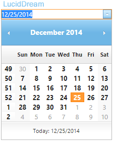
You can add various themes for the DatePicker to make a nice impression on your users. You can choose from 17 different themes, which is fantastic. Imagine how much time it will save. This user-friendly control allows us to navigate the DatePicker using either a mouse or the key board.
<ig:WebDatePicker ID="WebDatePicker1" runat="server">

</ig:WebDatePicker>
Add the above code to your page and run it. On the browser, set focus on the DatePicker control and use the key board to navigate it. To open the drop down Month calendar, press Ctrl and Down arrow keys combined. Later, use the arrow keys to navigate and choose the date of your choice.
Extract value from DatePicker using jQuery
Now, let us see how we can extract the value from the DatePicker control using jQuery. This is important because we will have to submit the value, once extracted. Along with DatePicker control, add another input box in the web page.
<ig:WebDatePicker ID="WebDatePicker1" runat="server">

    <ClientSideEvents ValueChanged="ValueChange" />

</ig:WebDatePicker>

<br />
<input type="text" id="dtValue" />
<script>
    function ValueChange() {
        var dt = $find('<%= WebDatePicker1.ClientID %>').get_value();
        var d = new Date(dt);
        var mon = d.getMonth();

        $('#dtValue').val(d.getDate() + '/' + (mon + 1) + '/' + d.getFullYear());
    }
</script>
Inside the markup section, I have added the <ClientSideEvent> tag and a property called ValueChanged. When a user changes or selects a date and switch focus to another element on the page, it will call the ValueChange() method in the script section, and will write the selected date value in the input box.
TextChanged() is another property that you can use to capture values from the datepicker.
Date Format
The default date format for the DatePicker is mm/dd/yyyy. However, you can change the format according to your choice, by simply adding a property called DisplayModeFormat. Let us set the format as dd/mm/yyyy.
<ig:WebDatePicker
    ID="WebDatePicker1"
    DisplayModeFormat="dd/MM/yyyy"
    runat="server">
</ig:WebDatePicker>
It actually changes to the desired format immediately after switching focus from the control.
Localization (Switch Format)
In the above example, I wrote about changing default date format to another. Later, I discovered a property, which allows web developers to localize the date (based on region) by choosing five different formats, other than the default format.
<ig:WebDatePicker
    ID="WebDatePicker1"
    Culture="en-US"
    runat="server">

</ig:WebDatePicker>
The formats are…
01) en-US (Default - US)
02) en-GB (British)
03) de-DE (German)
04) ja-JP (Japanese)
05) es-MX (Spanish)
06) uk-UA (Ukrainian)
The WebDatePicker is an amazing control. Its ground up design offer tremendous flexibility. The controls easy to use features, navigation etc will definitely leave an impression on your users.
