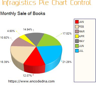
You can rotate the chart, change colors for each value (Chart Wedge), add a tooltip, create 3D Pie charts, Line charts, Area chart style etc.
Let us add this control on a web page and see how it works. Like other controls, you can drag and drop the Charting control on your web page. In the toolbar section, look for UltraChart in the Infragistics list of controls and add it. Immediately, it will show a pop-up window (a wizard) asking you to Select a Chart Type. You will see the “Chart Wizard” option and click the select button. Later, choose the chart type and click Finish.
I chose the Pie Chart 3D type for the demo, without selecting anything more from the wizard for the chart and went straight to the design mode. I wanted to see if I could add the properties at design mode or using Code behind procedures.
<igchart:UltraChart ID="UltraChart1" runat="server" ChartType="PieChart3D"
    EmptyChartText="Data Not Available.
    Please call UltraChart.Data.DataBind() after setting valid Data.DataSource"
    Version="14.2">
</igchart:UltraChart>
Look at it. The attribute EmptyChartText says “Data Not Available” and it is telling us how to bind a data source to it. I’ll show you how it is done.
using System;
using System.Web.UI.WebControls;
using System.Data;
using System.Data.SqlClient;

public partial class _Default : System.Web.UI.Page
{
    protected void Page_Load(object sender, EventArgs e)
    {
        if (!IsPostBack){ BindData(); }
    }
    private void BindData()
    {
        DataTable dt = new DataTable();

        using (SqlConnection con = new SqlConnection("Data Source=dna;Persist Security Info=False;" +
            "Initial Catalog=DNA_CLASSIFIED;User Id=sa;Password=;Connect Timeout=30;"))
        {
            using (SqlCommand cmd = con.CreateCommand())
            {
                cmd.CommandText = "SELECT TOP 7 Month, SalesFigure FROM dbo.Books_Annual_Sales";
                con.Open();

                SqlDataAdapter sda = new SqlDataAdapter();
                sda.SelectCommand = cmd;
                sda.Fill(dt);

                UltraChart1.DataSource = dt;
                UltraChart1.DataBind();

                UltraChart1.TitleTop.Text = "Monthly Sale of Books";         // THE HEADER.
                UltraChart1.TitleTop.FontSizeBestFit = True;

                UltraChart1.Legend.Visible = True;		// SHOW EACH MONTH WITH UNIQUE COLOR.
            }
        }
    }
}
Option Explicit On
Imports System.Data
Imports System.Data.SqlClient

Partial Class Site
    Inherits System.Web.UI.MasterPage

    Protected Sub Page_Load(sender As Object, e As System.EventArgs) Handles Me.Load
        If Not IsPostBack Then
            Me.BindData()
        End If
    End Sub

    Private Sub BindData()
        Dim dt As DataTable = New DataTable
        Using con As SqlConnection = New SqlConnection("Data Source=dna;Persist Security Info=False;" & _
            "Initial Catalog= DNA_CLASSIFIED;User Id=sa;Password=;Connect Timeout=30;")

            Dim strQuery As String = "SELECT TOP 7 Month, SalesFigure FROM dbo.Books_Annual_Sales"

            Using cmd As SqlCommand = New SqlCommand(strQuery)
                Dim sda As SqlDataAdapter = New SqlDataAdapter
                cmd.Connection = con : con.Open()
                sda.SelectCommand = cmd
                sda.Fill(dt)

                UltraChart1.Data.DataSource = dt
                UltraChart1.Data.DataBind()

                UltraChart1.TitleTop.Text = "Monthly Sale of Books"         ' THE HEADER.
                UltraChart1.TitleTop.FontSizeBestFit = True

                UltraChart1.Legend.Visible = True		' SHOW EACH MONTH WITH UNIQUE COLOR.
            End Using
        End Using
    End Sub
End Class
Simple, isn’t it. The SQL table has two columns, the Month and SalesFigure. The control uses the Month as Legend (the square boxes with unique colors). It needs at least one numeric value to display the chart in %.
I have added a header and named it “Monthly Sale of Books” to the top of the chart. However, it still does not look like the above figure. It is set upside down, which is default. As I said, we can rotate the charts according to our choice.
Appearance
You can change its appearance by using its in-built properties, such as XRotation, YRotation etc, either at design time or using code behind procedures.
Transform3D-Perspective="50"
Transform3D-ZRotation="0"
Transform3D-Scale="80"
Transform3D-XRotation="41"
Transform3D-YRotation="-18"

Border-Color="Transparent"
UltraChart1.Transform3D.Perspective = 50;
UltraChart1.Transform3D.Scale = 80;	    // SELECT FROM 0 to 100 TO INCREASE OR DECREASE THE RADIUS OF THE CHART.
UltraChart1.Transform3D.ZRotation = 0;
UltraChart1.Transform3D.XRotation = 61;
UltraChart1.Transform3D.YRotation = -18;
UltraChart1.Border.Color = Drawing.Color.Transparent;		// DON’T WANT ANY BORDER.
Run the application now, and you will see a more meaningful chart on your page. Each chart wedge describes itself using a different color. Every time you refresh the page, it chooses random colors for different sections. However, sometimes it uses a single color to define two different sections or values. It can confuse the user. Therefore, we will set colors on our own.
Custom Color using “ChartPalette” Property
The ChartPalette property allows developers to choose or set custom colors for the charts. We will use Asp.Net Color structure of System.Drawing namespace.
Using System.Drawing

Color[] customColors;
customColors = new Color[] {Color.Red, Color.Wheat, Color.OrangeRed,
        Color.Yellow, Color.Gray, Color.YellowGreen, Color.DeepSkyBlue};
UltraChart1.ColorModel.CustomPalette = customColors;
UltraChart1.ColorModel.ModelStyle = Infragistics.UltraChart.Shared.Styles.ColorModels.CustomLinear;
Imports System.Drawing

Dim customColors() As Color
customColors = New Color() {Color.Red, Color.Wheat, Color.RosyBrown,
        Color.Yellow, Color.Gray, Color.YellowGreen, Color.DeepSkyBlue}
UltraChart1.ColorModel.CustomPalette = customColors
UltraChart1.ColorModel.ModelStyle = Infragistics.UltraChart.Shared.Styles.ColorModels.CustomLinear
Add the above code (C# or Vb.Net) inside BindData() procedure that we have created before. For the seven months sales figure, we have added unique colors, each indentifying the charts wedges separately.
You can do so much with these features and properties, to make an impression on your users.
