Why Use DataList for AutoComplete?
Usually, the purpose of an Input box is to enter a set of values. It will not automatically suggest a word or two when you type a letter in the input box. It is not its default feature. However, to implement AutoComplete you will need to add a widget provided by a JavaScript framework, such as jQuery. These widgets use Ajax to fetch data from a remote (or local) data source, populate a list box and display the list below the input box. The feature requires you to write few lines of code at the client side.
However, with the Datalist element you do not have to write any code for AutoComplete. The element is an advanced version of HTML <select> element. The select element is a control for displaying a dropdown list on a web page. It was one of most commonly used control, before HTML5 introduced its new set of features and elements.
<select>
    <option>JavaScript</option>
    <option>Asp.Net</option>
    <option>Physics</option>
    <option>Clipart</option>
    <option>HTML5</option>
</select>
Output
How the Datalist Actually Works?
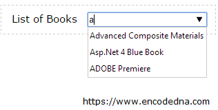
The Datalist has some similarities with the SELECT element. You will assign a pre-defined set of values to a Datalist as we have assigned data to the Select element. Except that, the former (Datalist) is not a stand-alone control. The Datalist element works in accord with an Input box. The Input elements “list” attribute will bind both the controls together. Let us see how we can do this.
<!doctype html>
<html>
<head>
    <title>HTML5 Datalist Example</title>
</head>
<body>
    <p>Set focus on the Input box and type a letter of your choice!</p>
    <div>
        <label style="padding:0 10px;">List of Books</label>
        <input type="text" list="books" />

        <datalist id="books">
            <option value="Advanced Composite Materials">
            <option value="Asp.Net 4 Blue Book">
            <option value="Teaching Science">
            <option value="Circuit Bending">
            <option value="ADOBE Premiere">
        </datalist>
    </div>
</body>
</html>See how the input’s list attribute binds the controls. The attribute simply refers to the id of the Datalist.
<input type="text" list="books" />
Browser Support:
Chrome 39.0 - Yes | FireFox 34.0 - Yes | Internet Explorer 10 - Yes | Safari - No
If you are using a Widget for AutoComplete, you will need an input box, a JavaScript framework and few lines of code to make it all work. However, with the DataList element it is very simple. Just hook it with the input element and you are ready to work with it.
However, with simplicity it has its own share of drawbacks. If you look at the code carefully, I have placed the controls inside a DIV element, in which I have defined a font and a size. The style property has zero affect on the Datalist element.
It has another drawback. When you enter a letter in the input box, it will look for a match with the “first” character of the words in the list. Now, that’s very annoying. If I enter the letter “b” and even though the list has words with “b” in between, it won’t return any value.
In my opinion, sometimes it is good to write your own code, so you can have full control on the element and its features. As of now, we will have to wait for a new version of this element (if at all) with some much-needed enhanced features.
