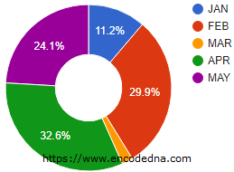
In my previous article, I have used the pieHole option to create a Donut chart. Its just a pie chart with a hole in the center. The default text that is displayed on the chart is percentage. Look at the figure below.

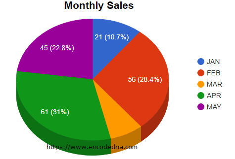
However, to show the value along with percentage on the Pie chart, you can use an option called pieSliceText and set the value as value-and-percentage. This is a combination of two values. See here.
<!DOCTYPE html>
<html>
<head>
    <script type="text/javascript" src="https://www.gstatic.com/charts/loader.js"></script>
</head>
<body>
    <div id="chart" style="width:900px; height:500px;"></div>
</body>
<script>
    // VISUALIZATION API AND THE PIE CHART PACKAGE.
    google.charts.load("visualization", "1", { packages: ["corechart"] });
    google.charts.setOnLoadCallback(DrawPieChart);

    function DrawPieChart() {
        // DEFINE AN ARRAY OF DATA.
        var arrSales =
        [
            ['Month', 'Sales Figure'],
            ['JAN', 21],
            ['FEB', 56],
            ['MAR', 14],
            ['APR', 61],
            ['MAY', 45]
        ];

        // SET CHART OPTIONS.
        var options = {
            title: 'Monthly Sales',
            is3D: true,
            pieSliceText: 'value-and-percentage'
        };

        var figures = google.visualization.arrayToDataTable(arrSales);

        // WHERE TO SHOW THE CHART (DIV ELEMENT).
        var chart = new google.visualization.PieChart(document.getElementById('chart'));

        // DRAW THE CHART.
        chart.draw(figures, options);
    }
</script>
See the options variable in the script and see how I have used "pieSliceText" option. I have an array with "month" and "sales figures" (in numbers). When you load the page without using the pieSliceText option, it will show the "percentage" (of total values) on each slice. This is its default behavior.
Note: If you are using dynamic data for your Google charts, you’ll have to define this option.
Now, create interactive and animated Graphs (charts) using Google Chart API.
Configuration Option pieSliceText
The configuration option "pieSliceText" is used to define the content of the text displayed on the slice. You can define it using "four" values.
• 'percentage': Shows the percentage of the slice size. For example,
var options = {
    pieSliceText: 'percentage'
};
• 'value': Shows values in each slice. For example, pieSliceText: 'value'
• 'label': The name of each slice. The name of label is also shown at right side of the chart. See the first image above.
var options = {
    pieSliceText: 'label'
};
• 'none': Use this option to hide texts on the slices. Show nothing if you wish.
• 'value-and-percentage': Finally, you can use this option to show both "percentage" and "value" on each slice. Like I have used in my example above.
var options = {
    pieSliceText: 'value-and-percentage'
};Browser Support:
Chrome 39.0 - Yes | FireFox 34.0 - Yes | Internet Explorer 10 - Yes | Safari - Yes
