Last updated: 11th January 2025
Presenting data using graphs is crucial as it provides a better understanding of the data to readers. People love to see their data in a graphical format since graphs present data in a well-organized manner. Graphs are excellent tools for analyzing historical data, sales, population trends, and more. Google Chart Tools offer simple, easy-to-use, interactive charts that you can add to your web pages. Best of all, the API is free.Interactive Pie Chart
A PieChart is one of the most popular chart types for graphically presenting data across different categories. This circular chart uses various colours to represent each category, making it easy to visualize and compare data.
Example:
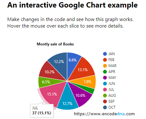
For the past many months, I have been selling books in various categories and I would like to display a visually appealing PieChart, where each block would represent the percentage of sale done for every month (starting January). Figures are not real, it is just a demo.
<!doctype html>
<html>
<head>
    <title>Interactive Google Chart Example</title>
    <script type="text/javascript" src="https://www.google.com/jsapi"></script>
</head>

<body>
  <h2>An interactive Google Chart example</h2>
  <p>Make changes in the code and see how this graph works. Hover the mouse over each slice to see more details.</p>

  <div id="b_sale" style="width:500px; height:300px;"></div>
</body>

<script>
    // VISUALIZATION API AND THE PIE CHART PACKAGE.
    google.load("visualization", "1", { packages: ["corechart"] });
    google.setOnLoadCallback(createPIE);

    function createPIE() {
        var options = {
            title: 'Montly sale of Books'
        };

        // CREATE A DataTable AND ADD DATA TO IT.
        var data = google.visualization.arrayToDataTable([
          ['Month', 'Sales Figure'],
          ['JAN', 21],
          ['FEB', 32],
          ['MAR', 19],
          ['APR', 8],
          ['MAY', 26],
          ['JUN', 31],
          ['JUL', 37],
          ['AUG', 16],
          ['SEP', 25],
          ['OCT', 30],
        ]);

        // THE TYPE OF CHART (PieChart IN THIS EXAMPLE).
        var chart = new google.visualization.PieChart(document.getElementById('b_sale'));
        chart.draw(data, options);      // DRAW GRAPH WITH DATA AND OPTIONS.
    }
</script>
</html>Browser Support:
Chrome - Yes | FireFox - Yes | Edge - Yes | Internet Explorer 10 - Yes | Safari - Yes
Output

Let me explain. First, I have add the Google AJAX API at the beginning of the code, inside the <head> tag.
<script type="text/javascript" src="https://www.google.com/jsapi"></script>
The API provides all the methods and properties that we need to draw the charts. Later, I have added a <div> element inside the <body> tag, which will display the graph when the page loads. The Width and Height of the <div> is set to 500px and 300px.
Now, this part is very interesting. The Google Chart provides "dynamic functions" and from a web designer’s point of view, it is very important. I have set the "Width" and "Height" again, and this time the value is set as auto.
<div id="b_sale" style="width:auto; height:auto;"></div>
The tool has adjusted itself according to the available space and displayed the Graph in an Interactive manner. (See picture below)

It now shows four distinct months, hiding the remaining months. However, it gave an option to scroll and view the remaining months. Click the blue arrow button down to see the other hidden months.
To see the sale figures you can hover the mouse over the Graph, which will show the Month, Number of Sales and the Percentage of sales done till date. This is cool.
The Script
Now, let us understand what happens within the <script> tag. The real action happens here.
We will load visualization using google.load() method. The Google Visualization API provides this method.
google.load("visualization", "1", { packages: ["corechart"] });
The method takes three parameters.
1) The first parameter is visualization that shows a beautiful graph on our web page.
2) The second parameter represents the version of the API and it is set as "1".
3) The third parameter represents the package, an array with a list of visualization. In the above example, I am using the corechart package for displaying data in the PieChart format.
🚀 You can also create line charts using Google Charts API. See this article on How to Create line charts using dynamic JSON data.
setOnLoadCallBack() Method
The stage is now set to add some data to the chart. Once the library is loaded, we will add data by creating a DataTable object. This object will hold the necessary data for making the graph. To ensure that the visualization API is fully loaded, we need to register a callback using the “setOnLoadCallBack()” method.
google.setOnLoadCallback(createPIE);
The method calls the createPIE() function, when it is sure that visualization API is fully loaded. createPIE() is a user defined function (UDF), where we add data and other properties to design our graph.
The Function createPIE()
At the beginning of this function, I have defined the options object (it comes with the API). In the example above, I have also added a title property to my graph that says Monthly sale of Books. The options method take other parameters too.
We can further customize our graph by defining different font size, color of the text, width, height etc.
options color
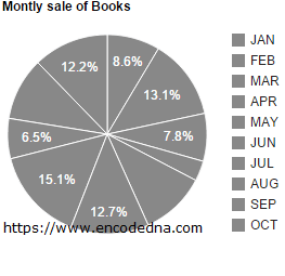
For example, if I want to add a single color (#888) to the graph, I'll do this.
var options = {
    title: 'Montly sale of Books',
    colors: ['#888']
};
Output

Be careful when defining the values for the options properties, else it will throw an error. If you have mistakenly set the value as '#888' instead of ['#888'] (the braces), then it will thrown an error, saying the color code in invalid.
# is not a valid color string
This is good, from a developer’s point of view. It catches and displays errors (if any) on the page, during design time itself.
options width and height
The width and height options are truly optional, since I have already added the width and height of <div> element in the example.
<body>
    <div id="b_sale" style="width:500px; height:300px;"></div>
</body>
However, I can manage the size of the graph by declaring the values using the options method itself.
var options = {
    width: 500,
    height: 200
};
options is3D
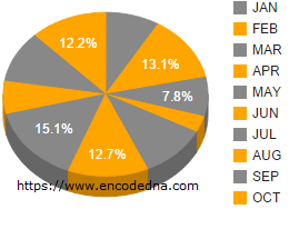
This is one option we all will be more interested in while designing our graphs. We can now display the graph in a three dimensional PieChart. It takes a Boolean value that is true or false. If set as “true” the graph is in 3D format.
Note: Remember the D in 3D is case sensitive. Therefore, you cannot write it as 3d.
var options = {
    title: 'Montly sale of Books',
    colors: ['#888', 'orange'],
    is3D: true
};
Create a DataTable object using arrayToDataTable() Method
It is available with version “1” of Google Visualization API. The method takes a parameter in the form of two-dimensional array (2D) and converts it into a DataTable. In our example, we have two columns (Month and Sales Figure) with many rows in it.
Types of Chart
Google Visualization API provides various methods for various chart types that we can use in our web page. In our above example, we have used the PieChart method to display a graph in pie format.
var chart = new google.visualization.PieChart(document.getElementById('b_sale'));There are other methods, which you can use in your web page(s) to make it look professional.
To display graphs in Bar format use “BarChart()” method. Using “ColumnChart()” method, we can display a vertical bar chart.
Draw the Graph
The Google Visualization API is loaded, we have set the options for our graph, registered the callback function, added required data for graph, and finally we will add the method to draw the graph.
chart.draw(dt, options); // DRAW GRAPH WITH DATA AND OPTIONS.The draw() method takes two parameters. The first parameter is the DataTable object with all the data in it. The second parameter has the options, such as the color, font, width, height etc.
The second parameter is optional. Either you allow the API to do its job by just passing the data, or set options on your own.
Pass only Data object, without the options
01) chart.draw(dt); - Leave options parameter blank
02) chart.draw(dt, null); - Pass a null value
If you have checked the Google links that I have provided in this article, you might have noticed the wide range of Chart tools Google has made available for us to use. The methods and its properties are simple and yet useful. All you need is to write few lines of code to add some nice looking graphs in your web pages. The purpose of this article is to help you do this with ease.
