Why use Media Queries?
We use CSS3 media queries for responsive web designing (such as mobiles or tablets) to apply different styles for different media types. The queries use @media rule and it is defined inside the <style> tag in a web page or in .css files.
Usually, we use a media query like this,
<style>
    .myClass {
      font-size: 30px;
    }

    @media screen and (max-width: 500px)
    {
      .myClass  { font-size: 20px; }
    }
</style>It means, if the screen or the browser window is 500px or smaller.
Width Between Two Values
Here's a DIV element with default style
<style>
  .intro {
    position: relative;
    top: 50px;
    color: red;
  }
</style>

<body>
  <div class='intro'
    Hello, I am Arun Banik!
  </div>
</body>
This is the default style and it looks similar in all devices.
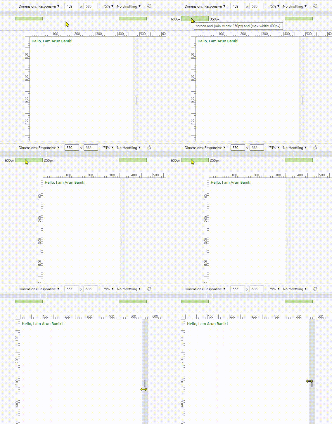
However, I want to assign a different class or different attributes (or values) for the <div> element, when the width is between 350px and 600px.
<!DOCTYPE html>
<html>
<head>
<meta name="viewport" content="width=device-width" />
<style>
  .intro {
    position: relative;
    top: 50px;
    color: red;
  }

  @media screen and (min-width: 350px) and (max-width: 600px)
  {
    .intro {
      top: 0;
      color: green;
      font-size: 20px;
    }
  }
</style>
</head>

<body>
  <div class='intro'>
    Hello, I am Arun Banik!
  </div>
</body>

</html>
Now see the media query in the above example. It has two values min-width and max-width. So, the new values appears (or the values changes) when the screen width is between 350px and 600px. Or else, the screen takes the default values (see the .intro class).

Note: Do not forget to add this line inside the <head> tag when you are using media queries.
<meta name="viewport" content="width=device-width" />
You must add the viewport to allow browsers to render responsive pages. The media queries will not work if you have not added the viewport.
