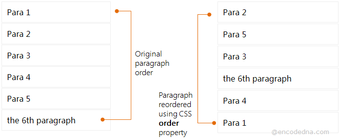
order Property Syntax
We’ll see the syntax of the order property first.
order: number (or a numeric value like 1, 2 etc.)
Note: IE 10 and earlier versions do not support the order property.
The order property applies to all flexible items (or flex items) inside a parent element. What does this mean? A parent element can be a <div>, which serves as a container and this element (the parent) should have a CSS3 Flexbox layout. For example,
<style>
div {
    display: flex;
    display: -webkit-flex;
}
</style>Remember: An element becomes flexible by setting its display property as flex.
Now, every element inside a <div> element will be flex items (or elements), and the order of these flex elements can be control. Here’s an example.
On my web page, I have few <p> elements inside a <div>. It’s a flexbox layout. Therefore, I want to reorder the <p> elements.
<!DOCTYPE html>
<html>
<head>
    <title>CSS order Property Example</title>
    <style>
    div {
        display: flex;
        display: -webkit-flex; 	/* Safari */
    }
    p {
	    padding: 10px;
        border: solid 1px #eee;
        margin: 1px;

    }

    /* Reorder <p> elements */
    .p1 { order: 5; }
    .p2 { order: 1; }
    .p3 { order: 3; }
    .p4 { order: 4; }
    .p5 { order: 2; }

    /* Safari */
    .p1 { -webkit-order: 5; }
    .p2 { -webkit-order: 1; }
    .p3 { -webkit-order: 3; }
    .p4 { -webkit-order: 4; }
    .p5 { -webkit-order: 2; }

    </style>
</head>

<body>
    <div>
        <p class='p1'> Para 1 </p>
        <p class='p2'> Para 2 </p>
        <p class='p3'> Para 3 </p>
        <p class='p4'> Para 4 </p>
        <p class='p5'> Para 5 </p>
    </div>
</body>
</html>If you see the result, the <p> elements are displayed in a new order, the order we have specified for each <p> individually.
I have used the class selector (.p1, .p2 etc.) in the <style> section to reorder all the flex elements. You can also use the element's id. For example,
<p id='p6' style='order: 3; -webkit-order: 3;'>,
the 6th paragraph
</p>
If you see the above example carefully, you can define the order property using the style attribute (inline styling).
Change Flex Direction in CSS
You can change the direction of the layout. In the above example, the paragraphs are shown horizontally, that is, elements are displayed side-by-side.
To show the <p> elements vertically, simply add the flex-direction: column; property value to the flex container like this,
div {
    display: flex;
    display: -webkit-flex; 	/* Safari */

    flex-direction: column;
}Browser Compatibility for CSS order Property
• IE 10 - No
• IE Edge - Yes it worked
• Firefox 62+ - Yes it worked
• Chrome (any) - Yes it worked
• Opera 56+ - Yes it worked
