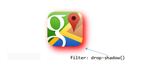
Using drop-shadow() function
<!DOCTYPE html>
<html>
<head>
<style>
  img {
    margin: 10px;
    filter: drop-shadow(5px 5px 5px red);
  }
</style>
</head>

<body>
  <img src='../../images/theme/googlemaps.png' />
</body>
</html>The drop-shadow() function in the above example took "four" parameters. The first 3 parameters defines the length of the shadow (offset-x or horizotal offset and offset-y or vertical offset). The 4th parameter is the color. If you omit the color parameter, it will use a default (darkish) color to add a shadow.
Ok, now try these 👇 examples.
1)
See there's a -ve (negative) value (the 2nd paramter). A "negative" offset-y value will show a shadow above the image.
img {
    margin: 10px;
    filter: drop-shadow(5px -5px 5px red);
  }
2)
A negative offset-x value will show a shadow at the "left" of the image.
img {
    filter: drop-shadow(-5px 5px 5px red);
  }
3)
Two "negative" value (offset-x and offset-y) will place the shadow at left above the image.
img {
    filter: drop-shadow(-5px -5px 5px red);
  }
4)
In this example, I have not defined offset-x and offset-y. It will create the shadow all around the image.
img {
    filter: drop-shadow(0 0 10px red);
  }
Difference between CSS filter drop-shadow and box-shadow Property
The box-shadow property is widely used to add shadow to an element, compared to drop-shadow(). But there's a difference.
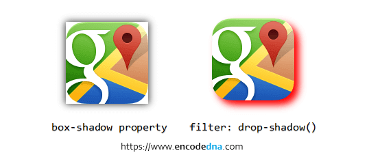
The box-shadow creates a shadow behind the image element.
The drop-shadow() filter function creates a shadow of the image (the non-transparent part of the image).
box-shadow versus drop-shadow. See the difference below.

Browser Support
The CSS drop-shadow filter function is supported in all mordern browsers.
