After I finished designing the responsive menus, I struggled to position the container at the right place. Usually, we use the float property in CSS to push an element either left or right. Here, in this case, the container is a DIV, which I tried to float at the right top corner. However, at the same time I have set the containers position as absolute. To my surprise, it was not working.
Now, the question is, how do I float an element right with position absolute. To understand this, I created a simple scenario. I have three DIV elements. The first DIV is the parent and the second and third DIV are inside the first. I want the third (last) DIV to float at the right top corner of the parent.
<div style="width:300px;
    height:100px;
    background:#CCFF33;
    padding:10px;">

    Parent Container

    <div style="padding:20px 0;">
        This is the second element
    </div>

    <div
        style="width:70px;
        height:auto;
        background:#CC0000;
        color:#FFF;
        padding:5px 2px;
        text-align:center;
        top:0;
        position:absolute; float:right;">

        MENU

    </div>
</div>
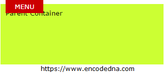
The image (the output) clearly shows that the property float: right and property position: absolute did not deliver the desired result. The absolute position of the third DIV element overrides the parent element’s position and it remains at top left of the screen.
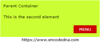
However, I could later position the Menu DIV at the right side of the screen by changing the position from absolute to relative, without changing the float property.
<div
    style="width:70px;
    height:auto;
    background:#CC0000;
    color:#FFF;
    padding:5px 2px;
    text-align:center;
    top:0;
    position:relative;float:right;">

    MENU

</div>
It still did not work the way I wanted it to be. The float property works fine with relatively positioned elements. Therefore, in the above example, the Menu element moves or floats to the right using its relative position. However, I want it to appear at right top corner, that is, above every element.
Absolute Positioning with “right” Property
The absolute positioning will override every other elements position, all I needed is the right element with the property. Therefore, I removed the float property and added the right property, with value set as “0”.
<div
    style="width:70px;
    height:auto;
    background:#CC0000;
    color:#FFF;
    padding:5px 2px;
    text-align:center;
    top:0;
    position:absolute;
    right:0;">

    MENU

</div>
“For absolutely positioned elements, it specifies the distance between the right margin edge of the element and the right edge of its containing block.”
The property right is best described here
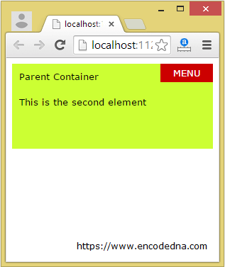
The Menu will now stick to the right top corner of the screen, irrespective of the screen size. You can drag the screen to increase or decrease the width of the screen and still the Menu remains there.
However, if you want the element (Menu) to stay inside the parent element, then set the parent elements position as “relative”. Finally, check the complete markup.
<html>
<head>
    <title></title>
</head>

<body>
    <div
        style="width:auto;
        height:100px;
        background:#CCFF33;
        padding:10px;
        position:relative;">

        Parent Container

        <div style="padding:20px 0;">
            This is the second element
        </div>

        <div
            style="width:70px;
            height:auto;
            background:#CC0000;
            color:#FFF;
            padding:5px 2px;
            text-align:center;
            top:0;
            position:absolute;
            right:0;">

            MENU

        </div>
    </div>
</body>
</html>Output

The article and its systematic illustration will give you an idea about how CSS properties such as position (absolute and relative), float and right actually works and how you can use them in your web applications. However, the main reason behind this article was to explain how to position an element to right of the screen, using absolute positioning.
If this article has helped you in any way, then share this with your friends. Leave a message below, if you have any queries or suggestions.
